The source collection of this room brings together the spectrum from purely archive-oriented designs to recent action posters. Based on this, Richard Niessen and Kylièn Bergh wrote an introduction, whcih, together with the source collection and a much more in-depth essay by Kylièn Bergh on productive archiving as a discursive approach to graphic design, has been published in a leaflet designed by Angèle Jaspers.
In her design, she uses the typographical bracket (a reference to what lies between) to create an archive-like labyrinth of dreamy clouds. The images seem to be on the other side of the paper, pressing through like vague memories.
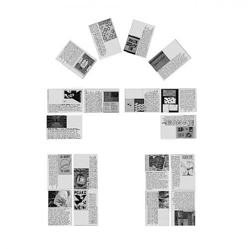
The format of the sheet is reminiscent of ballot papers, and the font used (American Typewriter), designed by Joel Kaden and Tony Stan in 1974, refers to the typewriter and is therefore both activist and bureaucratic.